Image Guidelines
The images we use across our website, social media and marketing are a key way we communicate our brand with consumers. Our images reflect our company values and our aesthetic and keeping them consistent builds trust with our audience.
In this article:
ArchiPro’s purpose is to assist those on the journey of building or renovating an architecturally designed home. Our homeowners value a high-end aesthetic and we believe in supporting their aspirations to realise their dream.
We believe in good design, quality products and clever innovation.
Our brand aesthetic supports these values: it’s graphic to grab your attention, yet pared back and simple, so that professionals, projects and products take centre stage.
Below we outline the standards for imagery across our platforms, and explain the image requirements for projects and products.
Image Do's & Don'ts
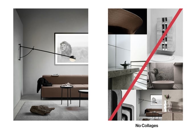
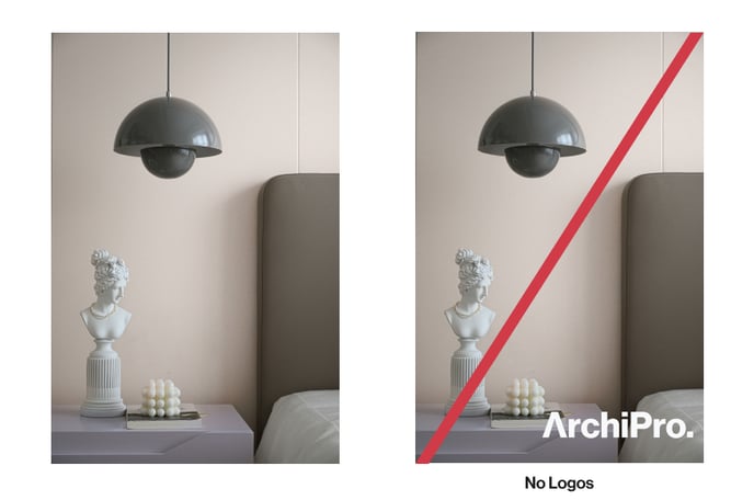
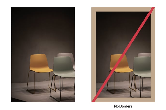
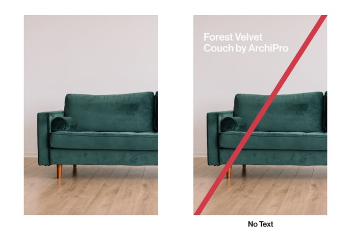
- No collages - These images are too busy and do not perform well with our audience. They are not appropriate to be used for advertising because they can be cluttered and overwhelming.
Project Imagery
To capture the true essence of a project, the imagery needs to evoke a sense of place, of materiality and mood. Below we’ve listed some criteria that will help you understand how you can achieve quality, design-led shots and show a project in its best light.
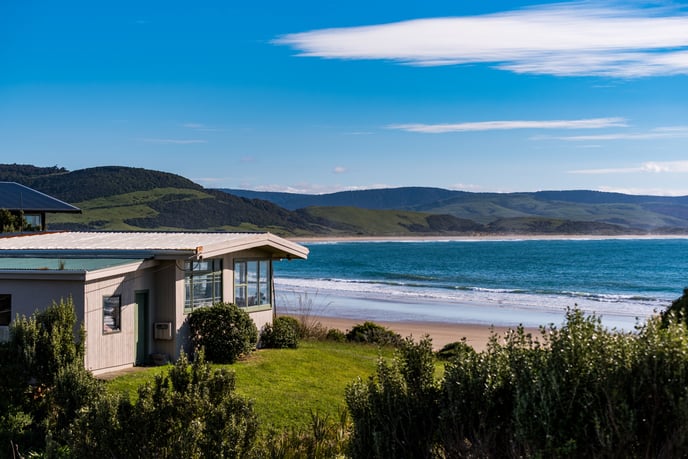
- Quality and clarity - imagery is high resolution and is taken by a professional photographer with a commercial quality camera.
- Architectural angles - capture the best aspects of the project through straight-on architectural angles.
- Lighting is key - bright, natural lighting to make the project stand out.
- Image types - capture a variety of imagery to showcase all aspects of the project. Exterior photos as well as interior images can give viewers a true representation of what was involved in the project.
- Additional touches/image styling - incorporating designer-only furniture and accessories in the shots is another great tip to bring the imagery to life.
- Number of Images - We require a minimum of 5 images (including your banner image) and recommend uploading no more than 25 images per project. Ideal number of images: 15-20.
Interior and exterior shots
Beautifully crafted images are equally as important as beautifully crafted words. ArchiPro’s copy guidelines embody our brand personality: cultured, sophisticated, understated, effortless, and cool. Equally, our images embody the same persona.
When it comes to exterior and interior shots, there are some key guidelines to ensure that all images reflect our brand identity.
Interiors
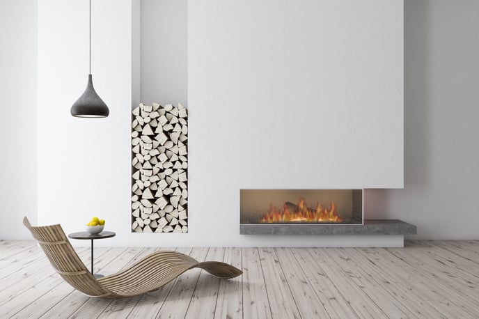
Images should:
- Have a contemporary feel
- Have a mix of materials and textures
- Interiors must be well lit
- Light can be used to enhance the architecture, for example, using shadow to highlight architectural features, shapes or mood
- Spaces should be devoid of clutter
- If there is furniture, it has to be strong designer brands or in classic shapes
- Lights can be on but don’t need to be
- Crop spaces into vignettes
- Avoid real estate-type wide angle shots (no wide angles to get the whole room in the shot)
- Images should be artistic and interesting rather than attempt to capture the whole space
- Avoid having people in shots, especially children (due to issues around permission)
- If people are in shots, they shouldn’t detract from the architecture and should be static, not moving. People should contribute to the image rather than attract attention.
- Same goes for animals in photos. They should only be there if they add value to the image.
Exteriors
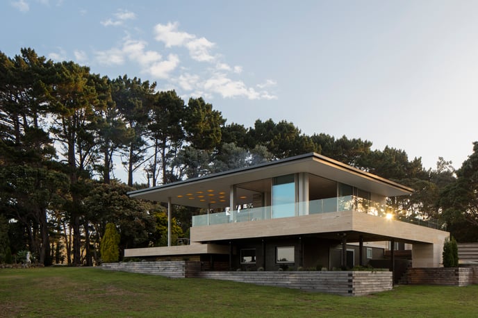
Images should be:
- Cinematic in mood
- Dramatic in composition
- Graphic – lines, angles and contrast
- Have high design values
- Have high picture clarity and quality
- Maximum real estate
- Seasonally relevant
- Straight-on architectural angles, not real estate angles
Technical requirements for images
- Banner dimensions: 1920 x 819 px at 72 - 300 dpi
- Logo Images - 1069 x 943
- About Page: Company Images - 1200 x 1200 px
- Project image dimensions: 1820 px x 818 px
Read this article for more information - Technical requirements for images
Product Images
Like project images, product images also need to embody the ArchiPro brand. This means that images need to be as “editorial” as possible, which means they look like they could be featured in a magazine article, rather than the ad that goes alongside the article.
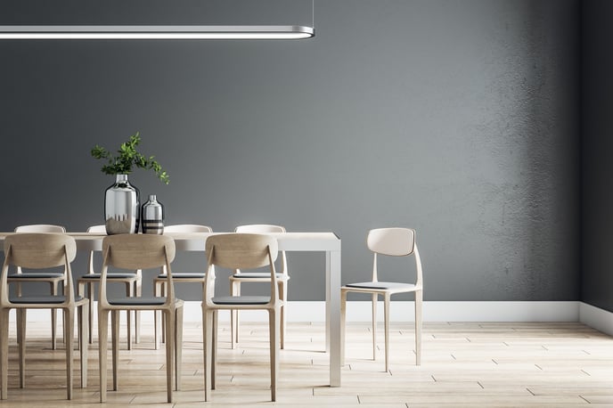
In practical terms it means product images should:
- Be design-led
- Be at a “lookbook” standard
- Not be clear-cut
- Be studio shots or lifestyle imagery only
- Be of a showroom-perfect standard
- Images should be moody, dramatic, or modern
- Devoid of clutter
When people feel like they’re being sold to, they’re much more likely to skip over an image. When it comes to products, it means the less your image looks like a “product shot”, the better. In short, product images should look as editorial as possible. An easy way to do this is to situate the product in a wider context, for example in an interior or exterior, and not focus the image solely on the single item.
Here are some other tips to ensure you product receives attention:
Capture unique selling points. Use angles to feature different aspects of the product.
Context and styling. The background/setting provides context. Make sure the product is styled correctly and is placed in an appropriate setting so consumers can visualise the product.
Quality and clarity. High resolution imagery with a clear purpose, taken with a professional camera/by a photographer.
Lighting is key. Use as natural lighting as possible to enhance the product and the corresponding scenery.
Type of shot. Studio shots or lifestyle imagery only. This creates scenery for the product which helps the customer visualise the product in their own setting. Ensure the setting is devoid of clutter.